
Custom fields
A field kind is a definition (config schema, value handling, validation, serialization) plus a
presenter that describes how to render it. You can write both declaratively with
defineFieldKind, or write the definition and point the presenter at your own custom element.
Declarative: defineFieldKind
Section titled “Declarative: defineFieldKind”Use this when one of the built-in widgets (text, number, boolean, select, date,
series) fits and only the meaning differs. This kind lets people type a percentage and sends the
model a fraction:
import { defineFieldKind, defineMLFormPlugin } from "mlform/view";import { baseFieldConfigSchema } from "mlform/schema";import { z } from "zod";
export const probabilityField = defineFieldKind({  kind: "probability",  schema: baseFieldConfigSchema.extend({    kind: z.literal("probability"),    decimals: z.number().int().min(0).max(4).default(1),  }),  value: {    default: () => null,    normalize: (value) => (value === null || value === undefined || value === "" ? null : Number(value)),    serialize: (value) => (value === null ? null : value / 100),  },  validateSync: ({ value }) =>    value === null || (Number.isFinite(value) && value >= 0 && value <= 100)      ? []      : ["Enter a percentage between 0 and 100."],  render: {    widget: "number",    hints: ({ config }) => ({ min: 0, max: 100, step: 10 ** -config.decimals, unit: "%" }),  },});
export const probabilityPlugin = defineMLFormPlugin({ fields: [probabilityField] });mountForm(container, { schema: { fields: [{ id: "rain-chance", kind: "probability", label: "Chance of rain", mappedTo: "p_rain" }] }, transport, plugins: [probabilityPlugin],});// typing 35 submits { p_rain: 0.35 }| Option | Purpose |
|---|---|
kind |
The name used in schemas. Must not collide with another registered kind. |
schema |
Zod schema for the config. Extend baseFieldConfigSchema so shared options (id, label, conditions, mappedTo, ui…) keep one definition. |
value.default |
Value when the schema and host give none. |
value.normalize |
Turns any incoming value (defaults, initialValues, user input) into the runtime value. Must be idempotent. |
value.clone, value.isEqual |
For values that are objects or arrays. |
value.serialize |
Runtime value to model value. |
validateSync |
Synchronous errors, run on every change. |
validate |
Errors that may be asynchronous, run on blur, field.validate(), and submission. Receives signal. |
render.widget |
The built-in control to use. |
render.hints |
Props for that control, as an object or a function of { config, fieldId, state, value }. Schema ui values are applied on top. |
definition |
Advanced hooks, below. |
normalize must return an equal value when given its own output: the runtime may normalize several
times while it settles conditional state, and it fails early if a value keeps changing.
Advanced definition hooks
Section titled “Advanced definition hooks”definition accepts lower-level hooks without leaving the declarative path. The kind, schema,
value adapter, and validators stay owned by defineFieldKind.
| Hook | Use it to |
|---|---|
validateConfig(config, { fail }) |
Reject incoherent configs during schema normalization, like min > max. |
getFieldReferences(config) |
Declare other field ids the config names, so missing ones fail normalization. |
getNestedFieldReferences(config) |
Declare nested kinds, as series columns do. |
validateRuntime(config, context) |
Check the assembled form when it is created. |
onValueChanged(value, config, context) |
Write derived values into other fields, as mapped categories do. |
getMappedTargets(config, { backend }) |
Declare every model key the field can write. |
getSubmissionEntries(value, serialized, config, { backend }) |
Write several model values, as one-hot categories do. |
A field that implements getSubmissionEntries must declare each possible target in
getMappedTargets; emitting an undeclared target fails the submission. Return undefined to fall
back to ordinary serialization and mapping, or [] to send nothing.
When a value is not JSON-compatible, add serializeSnapshotValue and restoreSnapshotValue so
drafts can store it.
Your own element
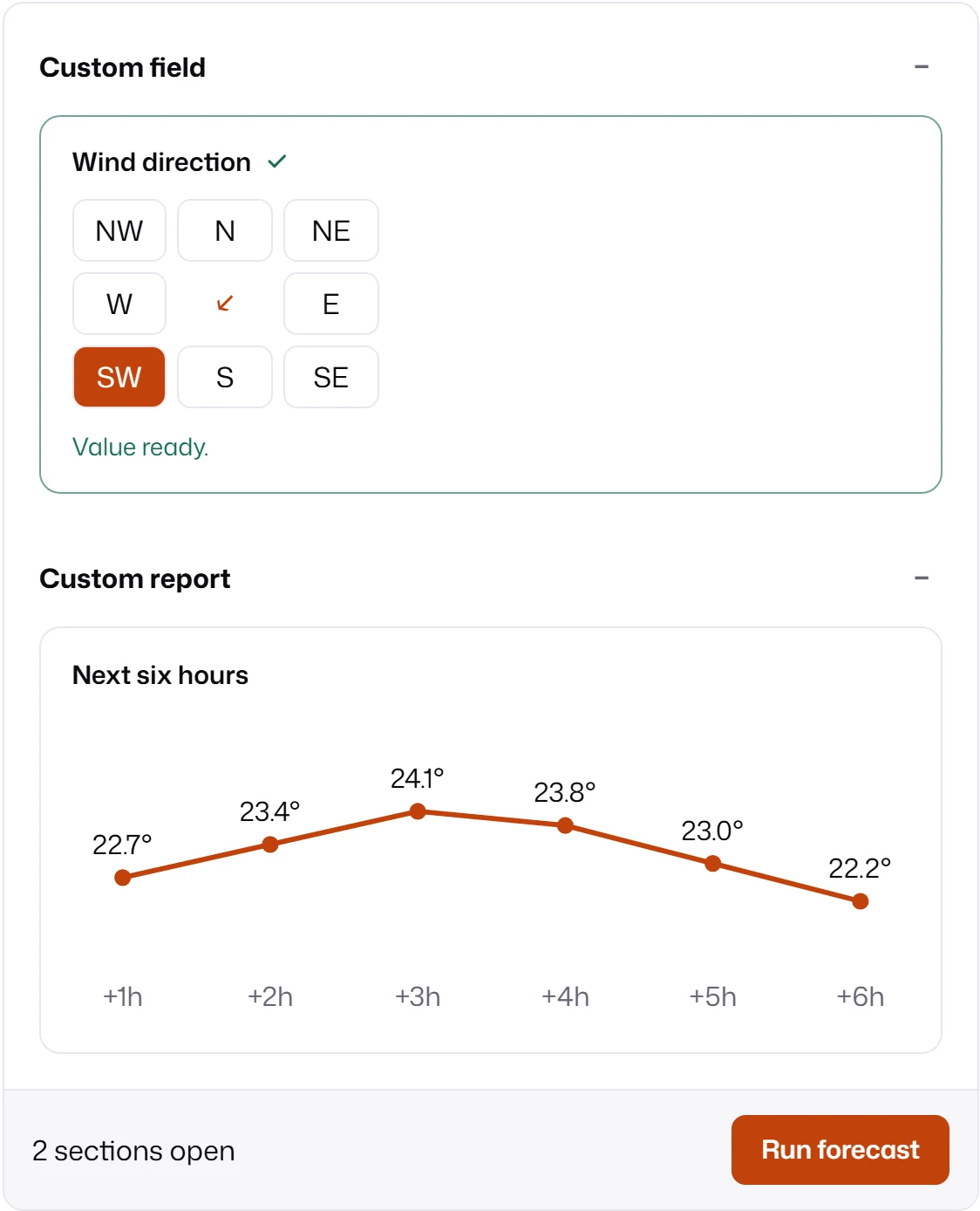
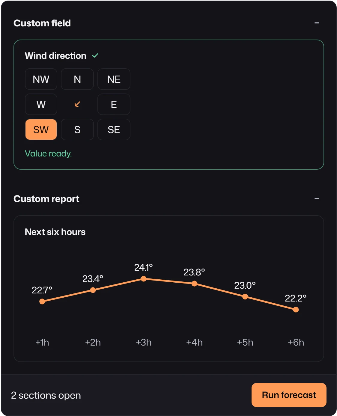
Section titled “Your own element”When no widget fits, render the field with your own Web Component. The compass below is the complete implementation used in the Plugins screenshot.
import { css, html } from "lit";import { PrimitiveFieldElement } from "mlform/primitives";import { baseFieldConfigSchema, defineFieldDefinition } from "mlform/schema";import type { MLFormFieldKind } from "mlform/view";import { z } from "zod";
const points = ["N", "NE", "E", "SE", "S", "SW", "W", "NW"];
// A compass rose of native radios, so arrow keys already move between points.class WindDirectionField extends PrimitiveFieldElement {  static styles = [    PrimitiveFieldElement.styles,    css`      fieldset {        display: grid;        grid-template: "NW N NE" "W C E" "SW S SE" / 1fr 1fr 1fr;        gap: 0.375rem;        width: 11rem;        margin: 0;        padding: 0;        border: 0;      }      label {        display: grid;        place-items: center;        height: 2.25rem;        border: 1px solid var(--mlf-color-border);        border-radius: var(--mlf-radius-md);        cursor: pointer;      }      label:has(:checked) {        background: var(--mlf-color-accent);        color: var(--mlf-color-text-inverse);      }      label:has(:focus-visible) {        outline: 2px solid var(--mlf-color-focus-ring);      }      input {        position: absolute;        opacity: 0;      }      output {        grid-area: C;        place-self: center;        color: var(--mlf-color-accent);        font-size: 1.25rem;      }    `,  ];
  render() {    const value = this.props.value as string;    const { controlId, describedBy } = this.getControlAttributes();    return html`      <fieldset aria-describedby=${describedBy ?? ""}>        <legend class="sr-only">${this.context?.label}</legend>        ${points.map(          (point) => html`            <label style="grid-area: ${point}">              <input                type="radio"                name=${controlId ?? "wind-direction"}                .checked=${value === point}                @change=${() => this.commitValue(point)}                @blur=${() => this.commitBlur()}              />${point}            </label>          `,        )}        <output style="rotate: ${points.indexOf(value) * 45}deg">↑</output>      </fieldset>    `;  }}customElements.define("wind-direction-field", WindDirectionField);
const definition = defineFieldDefinition({  kind: "wind-direction",  schema: baseFieldConfigSchema.extend({ kind: z.literal("wind-direction") }),  getDefaultValue: () => "N",  normalizeValue: (value) => (typeof value === "string" && points.includes(value) ? value : "N"),  // The model receives degrees clockwise from north.  serializeValue: (value) => points.indexOf(value as string) * 45,});
export const windDirection: MLFormFieldKind = {  category: "field",  kind: "wind-direction",  register(registry, descriptors) {    registry.registerField(definition);    descriptors.registerField({      kind: "wind-direction",      describe: (_config, { fieldId, state }) => ({        component: "wind-direction-field",        props: { id: fieldId, value: state.value },      }),    });  },};
The file has three parts:
- The element extends
PrimitiveFieldElementfrommlform/primitives, a Lit element that receives the field’s descriptor and render context. It readsthis.props.value, usesgetControlAttributes()for the control id andaria-describedby, and reports changes withcommitValue(value)and focus loss withcommitBlur().commitValueis ignored while the field is disabled or read-only. IncludingPrimitiveFieldElement.styleskeeps theme tokens and thesr-onlyclass available. - The definition is written with
defineFieldDefinitionfrommlform/schema: the same hooks as above, without the declarative wrapper. HereserializeValueturns"SW"into225for the model. - The registration is an
MLFormFieldKindwhoseregisteradds the definition to the engine registry and a presenter to the descriptor registry. The presenter’sdescribereturnscomponent: "wind-direction-field".
Finally the component name is mapped to the element’s tag, which is passed to mountForm as
primitiveRegistry (see weather-plugin.ts in Plugins):
import { createBuiltinPrimitiveRegistry } from "mlform/primitives";
export const primitiveRegistry = createBuiltinPrimitiveRegistry().registerField(  "wind-direction-field", // descriptor component  "wind-direction-field", // custom element tag);
Your element owns its accessibility: give the control a name (here a visually hidden legend),
keyboard operation (native radios provide arrow keys), a visible focus style, and the disabled and
read-only states from this.context.