
Field kinds
Every field has a kind. The kind decides which options the field accepts, what value it holds at
runtime, how that value is serialized for the model, and which control renders it. All kinds also
accept the shared field options.
| Kind | Runtime value | Renders as | Kind options |
|---|---|---|---|
text |
string |
single-line input | placeholder, minLength, maxLength, pattern |
long-text |
string |
multi-line text area | placeholder, minLength, maxLength, rows |
number |
number, draft string, or null |
numeric input or slider | min, max, step, unit, placeholder |
boolean |
boolean or null |
two-option radio group | trueLabel, falseLabel |
category |
string or null |
select | options |
single-choice |
string or null |
radio group | options, layout |
multi-choice |
string[] |
checkbox group | options, layout |
rating |
number or null |
row of score buttons | max, min, step |
date |
Date or null |
date input | min, max, step |
mapped-category |
string or null |
select | options with mapping |
onehot-category |
string or null |
select | options with mappedTo |
series |
array of row objects | editable table | columns, minPoints, maxPoints, aggregations |
The screenshots on this page are the built-in controls with the eshkra theme. Each code block is
the exact configuration that produced the screenshot beside it.
Text and long text
Section titled “Text and long text”text and long-text hold a string; an empty field is "". minLength, maxLength, and
pattern (a regular expression source, text only) apply to non-empty values, so combine them
with required when the field must be filled. Use rows to set the visible height of a
long-text area.
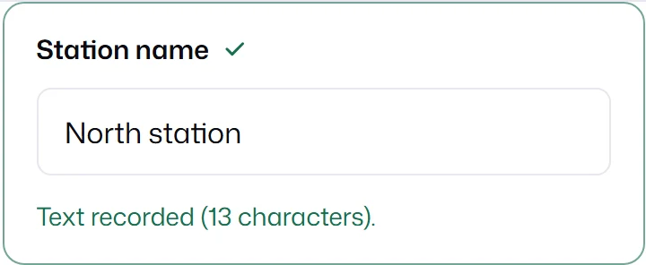
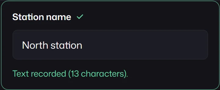
{ id: "text", kind: "text", label: "Station name", defaultValue: "North station", required: true,}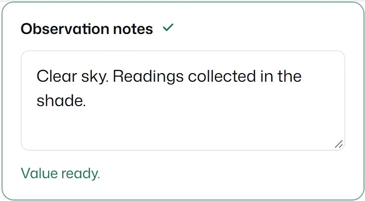
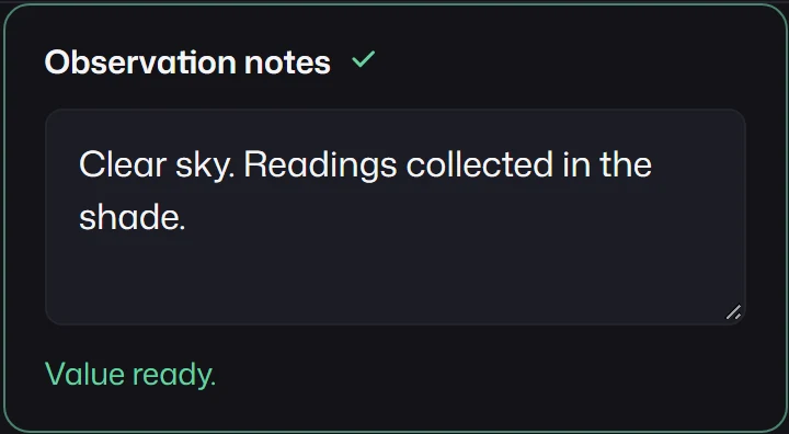
{ id: "long-text", kind: "long-text", label: "Observation notes", defaultValue: "Clear sky. Readings collected in the shade.", rows: 3,}Number
Section titled “Number”number holds a number, or null when empty. While the user types something that is not yet a
number, such as - or 1e, the field keeps the text as a draft string, shows it as invalid, and
blocks submission; it never coerces the draft to a number or to empty. min, max, and step
are validated, with step counted from min (or from 0 without min). unit is displayed
next to the value and never submitted.
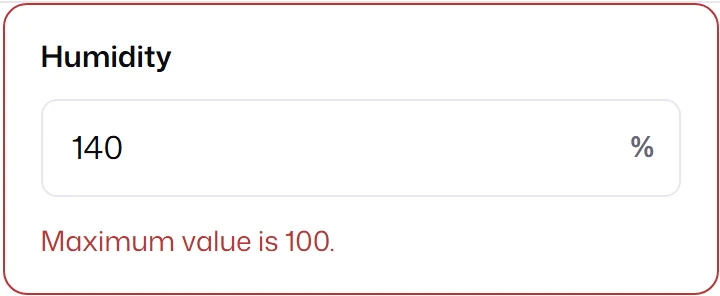
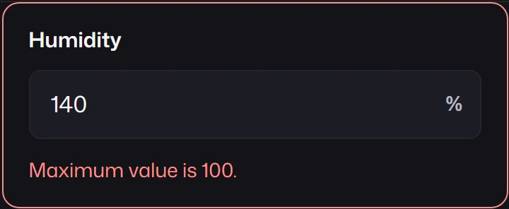
{ id: "invalid", kind: "number", label: "Humidity", unit: "%", defaultValue: 58, min: 0, max: 100, required: true,}An optional number with both min and max and a numeric defaultValue renders as a slider;
required numbers and numbers without both bounds render as a text input. Override the choice
with ui: { input: "range" } or ui: { input: "text" }. The choice does not change while the
user edits.
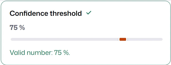
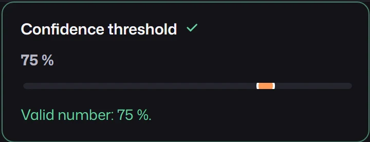
{ id: "range", kind: "number", label: "Confidence threshold", unit: "%", defaultValue: 75, min: 0, max: 100, step: 1,}Numeric text
Section titled “Numeric text”Number fields and numeric series cells share one parsing rule:
- Empty input becomes
null. - A decimal may use a dot or a single comma, with an optional exponent such as
1e-8. Grouping separators, hexadecimal, and binary notation are not accepted. - Non-finite results, overflow, non-zero values that underflow to zero, and integer strings that would round to a different integer are invalid.
- The editor keeps the text as typed, including trailing zeros and caret position; runtime values
and payloads contain normalized numbers. Arrow keys step by
step.
MLForm uses JavaScript numbers, not arbitrary-precision decimals. Invalid drafts survive draft snapshots so unfinished input is not lost.
Boolean
Section titled “Boolean”boolean holds true, false, or null before the user chooses. false is a value: required
asks for a choice, not for agreement. Rename the two options with trueLabel and falseLabel.
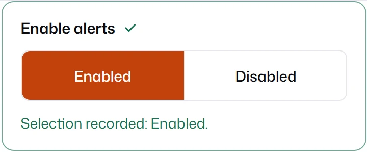
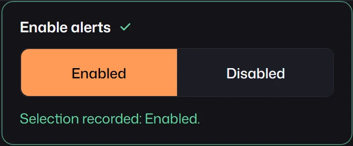
{ id: "boolean", kind: "boolean", label: "Enable alerts", defaultValue: true, trueLabel: "Enabled", falseLabel: "Disabled",}Category, single choice, multi choice
Section titled “Category, single choice, multi choice”All three take options as strings or { label, value } objects; the value is what the model
receives, the label is what people read. A value outside options is invalid.
categoryrenders a select and holds one value ornull.single-choicerenders the options as a radio group. Use it for a few options that people should see at once.multi-choicerenders checkboxes and holds an array of selected values, without duplicates. An empty array counts as empty forrequired.
layout: "horizontal" lays the choices of single-choice and multi-choice out in a row; the
default is "vertical".
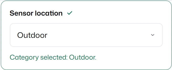
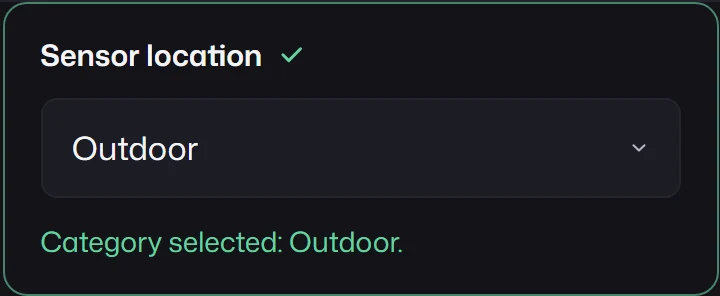
{ id: "category", kind: "category", label: "Sensor location", options: ["Indoor", "Outdoor", "Greenhouse"], defaultValue: "Outdoor",}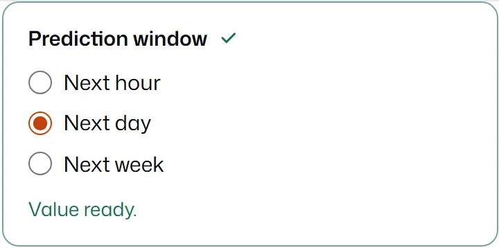
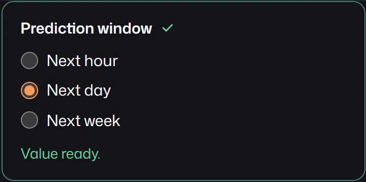
{ id: "single-choice", kind: "single-choice", label: "Prediction window", options: ["Next hour", "Next day", "Next week"], defaultValue: "Next day",}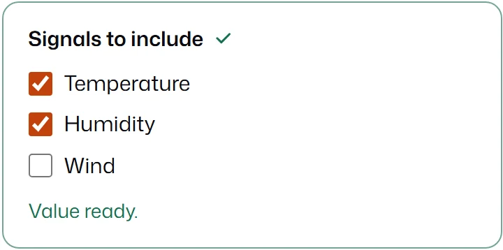
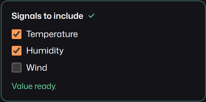
{ id: "multi-choice", kind: "multi-choice", label: "Signals to include", options: ["Temperature", "Humidity", "Wind"], defaultValue: ["Temperature", "Humidity"],}Rating
Section titled “Rating”rating holds an integer score from min (default 1) to max (required), in increments of
step (default 1). Scores render as a radio group of buttons; arrow keys, Home, and End move the selection.
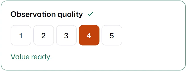
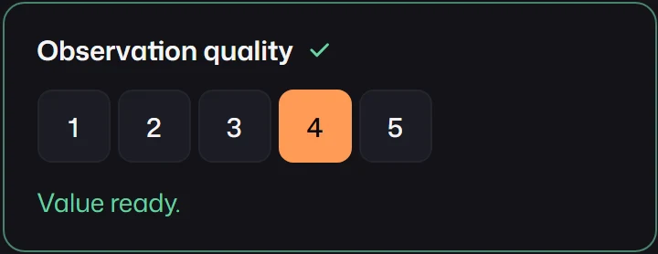
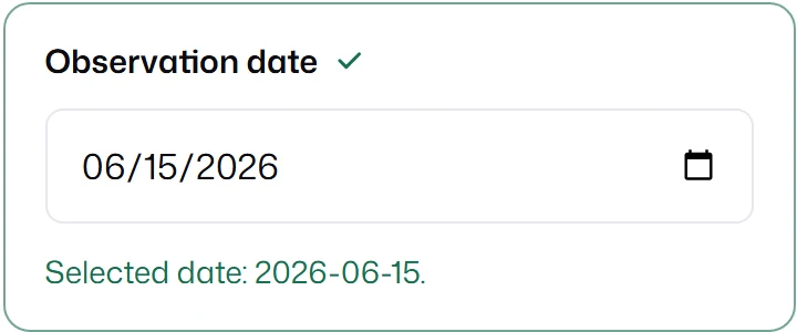
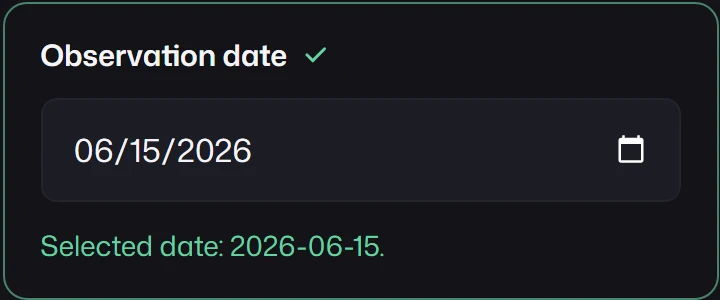
{ id: "rating", kind: "rating", label: "Observation quality", max: 5, defaultValue: 4,}date holds a Date, or null. It accepts ISO strings and Date objects as defaultValue and
initialValues, and submits a full ISO timestamp such as "2026-06-15T00:00:00.000Z". min and
max are date strings; step is a number of days counted from min, or from 1 January 1970
without min.
{ id: "date", kind: "date", label: "Observation date", defaultValue: "2026-06-15",}States every kind shares
Section titled “States every kind shares”Required, constraint errors, read-only, disabled, and inline descriptions come from shared options and look the same across kinds.
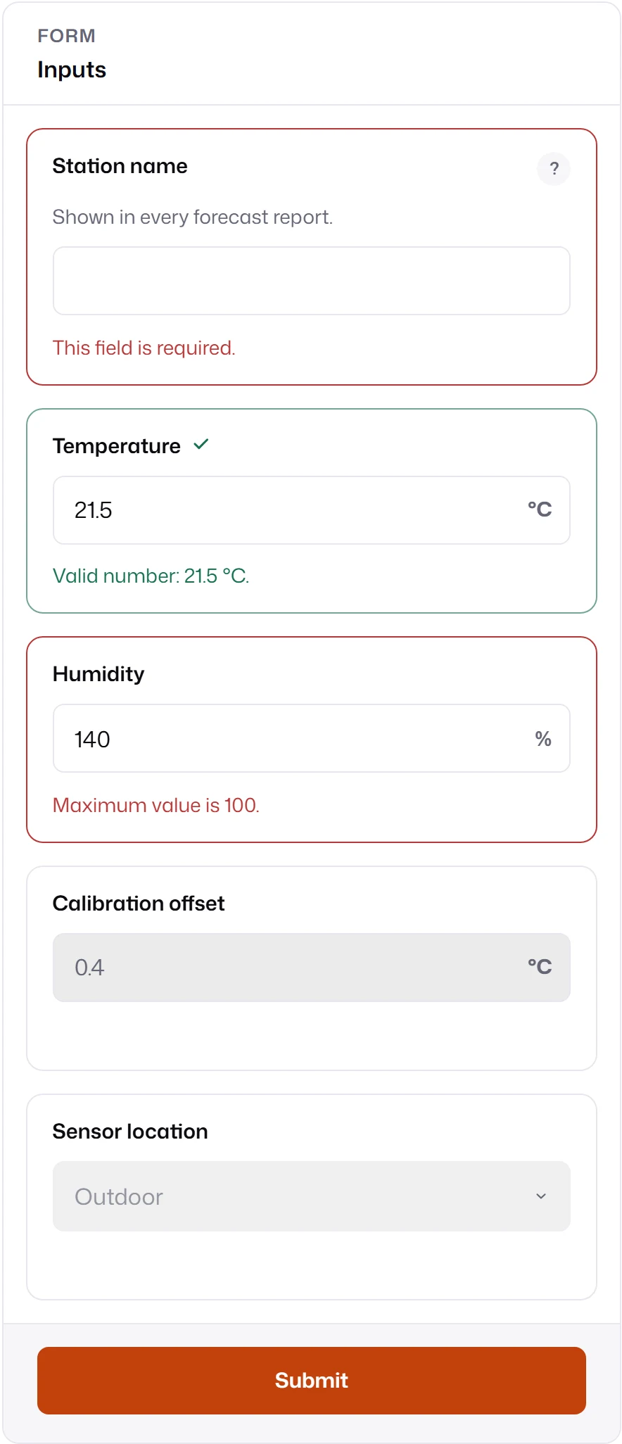
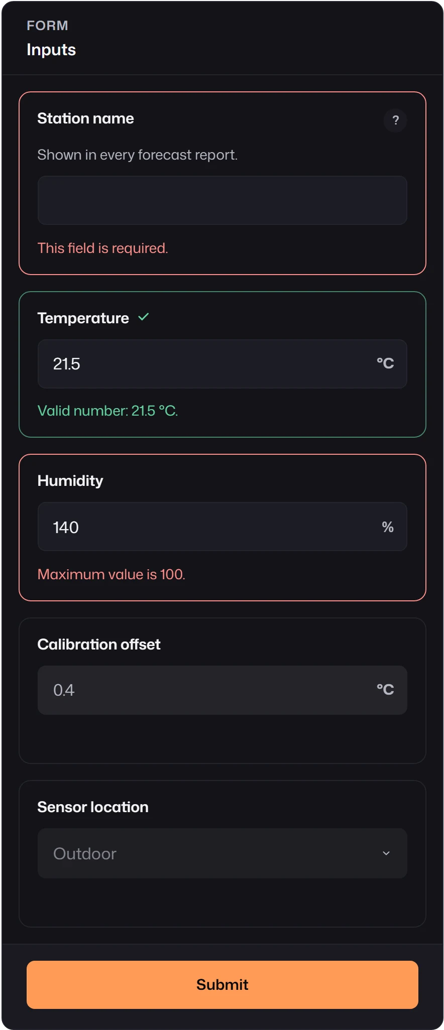
- Errors for non-empty values appear as soon as the value is set, including defaults and loaded values. Empty fields stay quiet until edited, blurred, or validated.
- A read-only field shows its value and still validates; its text remains selectable.
- A disabled or hidden field is inactive: it skips validation and, by default, is not submitted. See Conditions.
Fields that send several model values
Section titled “Fields that send several model values”Three kinds turn one visible control into more than one model input. Each has its own page.
onehot-categorysends one0/1column per option.mapped-categorywrites a preset of values into other fields.seriescollects rows and can send statistics calculated from them.
Need a kind that is not here? Custom fields use the same registration, validation, and submission path as these built-ins.